User interface
In the Metrics view, the horizontal axis is wall clock time. By default three metric graphs are shown.
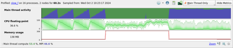
The top graph is the Main thread activity chart, which uses the same colors and scales as the per-line sparkline graphs described in Source code (MAP). Linaro recommends that you read that section to help understand the Main thread activity chart.
For CUDA programs profiled with CUDA kernel analysis mode enabled, a Warp stall reasons graph also displays. This shows the warp stalls for all CUDA kernels detected in the program, using the same colors and scales as the GPU kernel graphs described in CUDA Kernel analysis. Linaro recommends that you read that section to help understand the Warp stall reasons graph.
All of the other metric graphs show how single numerical measurements vary across processes and time. Two frequently used graphs are CPU floating-point and Memory usage. However, there are many other metric graphs available, and they can all be read in the same way. Each vertical slice of a graph shows the distribution of values across processes for that moment in time. The minimum and maximum are clear, and shading is used to display the mean and standard deviation of the distribution.
A thin line means all processes had very similar values. A large shaded region means there is significant imbalance between the processes. Extra details about each moment in time appear below the metric graphs as you move the mouse over them.
The Metrics view is at the top of the user interface because it ties all the other views together. Move your mouse across one of the graphs, and a black vertical line appears on every other graph in Linaro MAP, showing what was happening at that moment in time.
You can also click and drag to select a region of time within it. All the other views and graphs now redraw themselves to show just what happened during the selected period of time, ignoring everything else. This is a useful way to isolate interesting parts of the execution of your program. To reselect the entire time range double-click or click Select All.
In this figure, a short region of time has been selected around
an interesting sawtooth pattern in time in MPI_Barrier because PE 1 is causing delays.
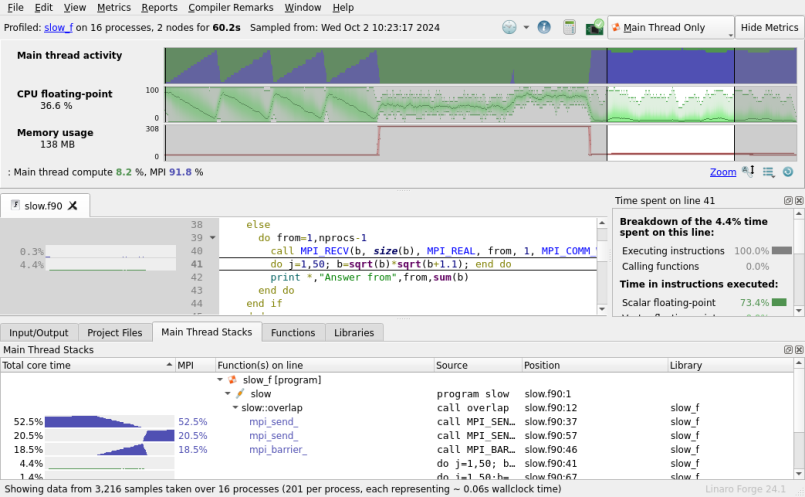
The first block accepts data in PE order, and is severely delayed. The second block is more flexible, accepting data from any PE, so that PE 1 can compute in parallel. The Source code viewer shows how compute and communication are serialized in the first block, but overlap in the second.
There are many more metrics other than those displayed by default. Click Metrics or right-click on the metric graphs to choose choose one of the available presets or any combination of the metrics beneath them. You can return to the default set of metrics at any time by choosing the Preset: Default option.