View source code (MAP)
Source and header files found in the executable are reconciled with the files present on the front-end server, and are displayed in a tree view in the Project Files tab of the Project Navigator window.
Click on the file name to view the source file.
The Source code viewer supports automatic color syntax highlighting for C and Fortran.
You can hide functions or subroutines you are not interested in by clicking the '-' glyph next to the first line of the function. This will collapse the function. Click the '+' glyph to expand the function again.
The centre pane shows your source code, annotated with performance information. All the charts you see in Arm® MAP share a common horizontal time axis. Your job starts from the left and ends on the right. Next to each line of source code are the sparkline charts. The sparkline charts show how the number of cores executing that line of code varies over time.
What does it mean to say a core is executing a particular line of code?
In the Source code viewer, Arm® MAP uses inclusive time, that is, time
spent on this line of code or inside functions called by this line. The
main() function of a single-threaded C or MPI program is typically at
100% for the entire run.
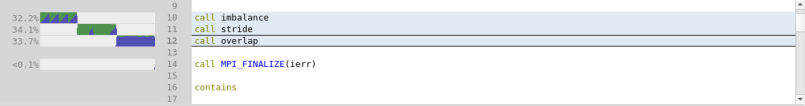
Only 'interesting' lines generate charts, that is, lines in which at least 0.1% of the selected time range was spent. In the previous figure, three different lines meet this criterion. The other lines were executed as well, but a negligible amount of time was spent on them.
The first line is a function call to imbalance, which runs for 30.4%
of the wall-clock time. Looking closer, as well as a large block of
green, there is a blue sawtooth pattern. Color identifies different
kinds of time. In this single-threaded MPI code, there are three colors:
- Dark green Single-threaded computation time. For an MPI program, this is all computation time. For an OpenMP or multi-threaded program, this is the time the main thread was active and no worker threads were active.
- Blue MPI communication and waiting time. Time spent inside MPI calls is blue, regardless of whether that is in MPI_Send or MPI_Barrier. Typically you want to minimize the amount of blue, because the purpose of most codes is parallel computation, not communication.
- Orange I/O time. All time spent inside known I/O functions, such as reading and writing to the local or networked filesystem, is shown in orange. It is important to minimize the time spent in I/O. On many systems, the complex data storage hierarchy can cause unexpected bottlenecks to occur when scaling a code up. Arm® MAP always shows the time from the program's point of view, so all the underlying complexity is captured and represented as simply as possible.
- Dark purple Accelerator. The time the CPU is waiting for the accelerator to return the control to the CPU. Typically you want to minimize this time, to make the CPU work in parallel with the accelerator, using accelerator asynchronous calls.
In the above screenshot, you can see the following:
- First, a function called
imbalanceis called. This function spends around 55% of its time in computation (dark green) and around 45% of it in MPI calls (blue). Hovering the mouse over any graph shows an exact breakdown of the time spent in it. There is a sawtooth pattern to the time spent in MPI calls that is investigated later. - Then, the program moves on to a function called
stride, which spends almost all of its time computing. You will see how to tell whether this time is well spent or not. At the end, you can also see an MPI synchronization. The triangle shape is typical of ranks finishing their work at different times, and spending varying amounts of time waiting at a barrier. Triangles in these charts indicate imbalance. - Finally, a function called
overlapis called, which spends almost all of its time in MPI calls. - The other functions in this snippet of source code were active for <0.1% of the total runtime and can be ignored from a profiling point of view.
Because this example was an MPI program, the height of each block of color represents the percentage of MPI processes that were running each particular line at any moment in time. The sawtooth pattern showing MPI usage indicates that:
- The
imbalancefunction goes through several iterations. - In each iteration, all processes begin computing. There is more green than blue.
- As execution continues, more processes finish computing and transition to waiting in an MPI call. The transition causes the distinctive triangular sawtooth pattern which illustrates a workload imbalance.
- As each sawtooth pattern ends, all ranks finish communicating and the pattern begins again with the next iteration.
This is a classic sign of MPI imbalance. A sawtooth pattern in MAP graphs show that at first, only a few processes change to a different state of execution. Subsequently, more of these processes change until they all synchronize and move on to another state together. These are areas of interest that are worthwhile investigating.
To explore this example in more detail, open the examples/slow.map
file and look at the imbalance function. Identify and investigate why some processes take longer to finish computing than others.